
Best Art Direction in Indie Games 2026
From painterly worlds to PS1-era throwbacks, these indie games proved that art direction beats polygon count every time. Retro is back and bigger than ever.
# The Retro Revival Is Here
2026 is the year retro art direction went mainstream. While AAA studios keep chasing photorealism, indie developers are proving that deliberate low-fidelity aesthetics can outsell and outshine high-budget visuals. The trend is not nostalgia for nostalgia's sake. It is a conscious art direction choice, and it is working.
# R.E.P.O. - Horror Through Simplicity
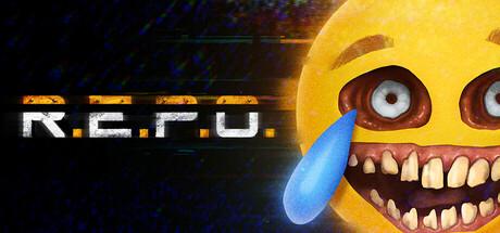
One of the biggest breakout hits of early 2026. R.E.P.O. is a co-op horror game that uses a deliberately lo-fi visual style: chunky geometry, limited texture resolution, and harsh lighting that creates genuine tension.
The art direction proves that horror does not need photorealism. The low detail forces the player's imagination to fill in the gaps, and that is scarier than any 4K texture. The environments are masterfully lit: pools of light surrounded by pitch-black voids, flickering fluorescents, and volumetric fog that hides just enough. Over 119,000 reviews at 96% positive speak for themselves.
What artists can learn from R.E.P.O.:
- Lighting carries the scene: Simple geometry with strong lighting reads better than detailed geometry with flat lighting
- Constraint breeds creativity: The low-poly aesthetic forces every shape to be intentional and readable
- Atmosphere over fidelity: Fog, sound, and pacing matter more than texture resolution
# PEAK - 10 Million Copies of Lo-Fi
PEAK takes a completely different approach. Developed by Aggro Crab and Landfall, it applies lo-fi visual language to a co-op climbing game about scaling a mysterious mountain. Chunky geometry, simplified textures, and atmospheric fog create a sense of isolation and discovery. The game sold over 10 million copies, proving that stylized simplicity has genuine mass appeal.

What makes PEAK work visually:
- Intentional simplicity: Every shape is readable and the color palette is carefully tuned per biome
- Fog as a design tool: Limited visibility creates mystery. New vistas emerge during the climb, rewarding exploration
- Strong composition with basic shapes: Mountains, valleys, and structures are composed like landscape paintings despite the low geometry
- Daily rotation: The island changes every 24 hours, keeping the visual experience fresh without high-fidelity assets
# Why Lo-Fi Is Exploding
This is not a niche trend anymore. There are hard practical reasons:
- Solo dev friendly: One person can ship a full game's worth of lo-fi assets in the time it takes to make a single AAA prop
- Runs on anything: Low-spec games have a massive potential audience
- Stands out on Steam: When every thumbnail looks like Unreal Engine 5, a retro throwback grabs attention instantly
- Horror is better imprecise: The uncanny, wobbly look of retro 3D triggers unease that polished graphics cannot replicate
Across every style, the strongest indie games in 2026 follow the same principles:
- Restrictive palettes: Fewer colors, used with intention
- Readable silhouettes: Characters and landmarks work at any scale
- Internal consistency: Define your visual rules and stick to them everywhere
- Post-processing as identity: Screen effects define how the game feels, not just how it looks
- Constraint as a feature: Limitations are embraced and turned into style
# For Your Portfolio
Studios and players value personality over technical complexity. A portfolio piece with strong color design and readable shapes will outperform a technically perfect but bland environment. If you can show range, a polished stylized piece alongside a deliberately lo-fi retro piece, you demonstrate understanding of art direction, not just software skill.
Indie Art Direction Industry Retro REPO PEAK


